What are the Seven New Management & Planning Tools?
→ The New 7 QC Tools or Seven Management and Planning Tools are defined as the systematic methods for achieving expected outcomes. It is also known as "7M Tools".
→ These tools are very famous for their use in planning, problem-solving, and
set organizational or personal goals.
→ They enhance the quality of the products and services of the organization.
→ Basically, these tools help us for making the better planning of New Product Launch, Product Development, and achieve organizational goals.
→ They enhance the quality of the products and services of the organization.
→ Basically, these tools help us for making the better planning of New Product Launch, Product Development, and achieve organizational goals.
→ The Management and Planning Tools are very much used in Six Sigma Projects
for converting the Voice of Customers into the Technical Requirements.
The New 7 QC Tools are
- Affinity_Diagram
- Interrelationship_Diagram
- Tree_Diagram
- Matrix_Diagram
- Matrix Data Analysis Chart
- Arrow_Diagram
- Process Decision Program Chart
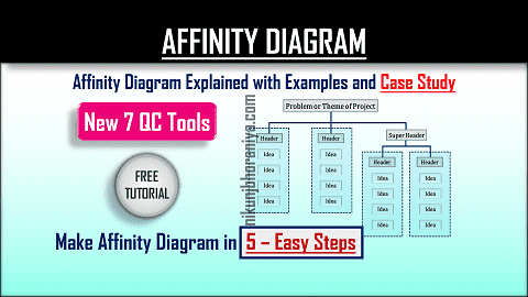
→ This tool is also known as a KJ Method because it was invented by a Japanese
anthropologist Jiro Kawakita.
→ During the creation of an affinity_diagram, all team members need to brainstorm and collect the ideas as much as possible.
→ During the creation of an affinity_diagram, all team members need to brainstorm and collect the ideas as much as possible.
→ So that based on an idea, we need to arrange the data as per their natural
relationship for solving the problem.
→ Detailed Article:
Affinity_Diagram Explained with Example and Case Study in Simple 5 Steps
[2] Interrelationship Diagram:
→ We can use this tool for analyzing complex things in a simple way.
→ This tool is also used to solve a very critical and confusing problem very easily.
→ This tool is also used to solve a very critical and confusing problem very easily.
→ Detailed Article:
Interrelationship_Diagram Explained with Example and Case Study in Simple 4 Steps
[3] Tree Diagram:
→ The Tree_Diagram helps us to make our planning more accurately.
→ It breaks our objectives into sub-tasks and sub sub-tasks and so on.
→ We can achieve our objectives with the help of the Tree_Diagram.
→ During this activity, we are moving from general ideas to very specific
goals.
→ The other names of the Tree_Diagram are (a) Systematic_Diagram, (b)
Dendrograms, (c) Hierarchy diagram, (d) Organisation chart, and (e) Analytical
Tree.
→ Detailed Article: Tree_Diagram Explained with Example and Case Study in Simple 5 Steps
→ Matrix_Diagram Shows the relationship between more than one group of data
sets to each other.
→ Detailed Article: Tree_Diagram Explained with Example and Case Study in Simple 5 Steps
[4] Matrix Diagram:
→ In other words, we can say that this tool is used for many to many
comparisons.
→ The Matrix_Diagram gives us clarity of the relationship between the
different sets of data.
→ This tool is very helpful for developing the Quality Function Deployment
(QFD).
→ Detailed Article:
Matrix_Diagram Explained with Example and Case Study in Simple 5 Steps
→ We can easily perform market research and make a strategy for new products
and services launching in the market.
→ Matrix Data Analysis Chart is also used as a Prioritization Matrix.
→ Detailed Article:
Matrix Data Analysis Chart Explained with Example and Case Study in Simple 4 Steps
→ We can optimize the tasks and processes of our project with the help of this
tool.
→ It is also known as Activity Network_Diagram, Network_Diagram, and Activity
Chart.
→ Arrow_Diagram is broadly used in the Program Evaluation and Review
Technique [PERT], and Critical Path Method [CPM].
→ Detailed Article: Arrow Diagram Explained with Example and Case Study in 5 Easy Steps
[7] Process Decision Program Chart:
→ In other words, we can say that this tool is used for forecasting the
failures that may happen while the implementation of the project.
→ With the help of this tool, we can revise our project steps that might go
wrong.
→ Detailed Article: Process Decision Program Chart Explained with Example and Case Study in Simple 5 Steps


إرسال تعليق